First Impressions -- 3 Steps To Creating A Great Flyer Even If You're An Amateur
Admin • August 1, 2017
Creating business advertising materials when you're on a budget can be hard. You may find that you have to do some of the legwork yourself in order to save money for things that you can't do on your own.
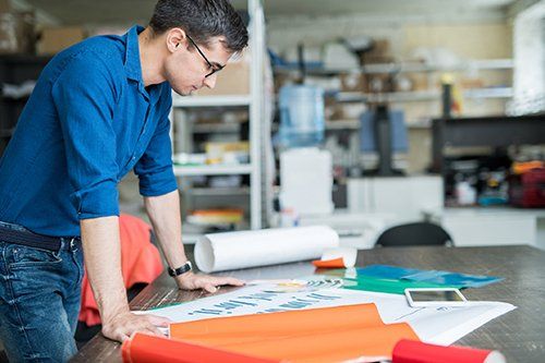
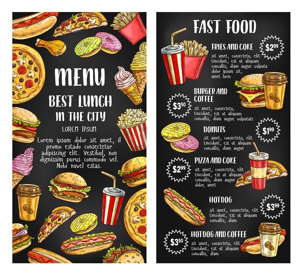
Creating a great flyer to attract clients' attention is one of those things. If you're tackling the design of a flyer to promote your company, you may want to do some of the creation yourself. This allows you to use a higher quality printing service to give it a professional finish.
So, how can you create the outline of a great flyer? Here are 3 basic steps anyone can manage.
Make a Plan
Before you get out a computer and start creating a draft layout, take the time to make a plan. You'll want to determine exactly how much information is absolutely necessary to convey. Trim down the wording as much as possible to make it easily digestible by passers-by.
Sketch out a few ideas, paying attention to the layout of words, dates, prices, and the like. You can play around with specific pictures and other details later. Giving attention to the information you need to convey will help you focus on the function of the flyer rather than get bogged down with its style.
One simple trick to create a more professional look is to create a grid. Divide the page vertically into three or four sections. Use each section to house a different part of the information. For example, place an image in the top third, then add the product details in the center with your company information or another image in the bottom third.
Find Images
You'll need some high-quality photo images to work with. Ideally, these will be something personalized from your business -- such as photos of your product or your location. Most flyers look best with a limited number of photos -- often only 2 or 3 -- to keep customers focused and not get into too much detail.
Photos for any advertising materials should generally be simple and clearly defined. Avoid pictures that require a lot of focus to understand or discern details. If you have mere seconds to attract a client to your advertisement, you can't afford a picture that's unclear.
If you don't have high resolution images available, using lower quality photos is probably not a great solution. You may be better off locating some stock images on the internet. Look for photos that can be used freely and reflect the feelings or impression you want to relate.
Combine Images and Text
Increase the size of your selected images to take up much of the page and add text over them. This reduces boring white space on the flyer and makes you less obligated to be creative with the page design. If the images are too dark to place text on top, reduce the opacity to 75% or less so that it forms a good background for text.
Be judicious about the use of multiple photos to avoid a flyer that's busy and distracting. Allow image and words to have space to breathe, keeping them simple and clearly understood. You may want to ask a few objective people to look at your draft to determine if they can glean the relevant information from it quickly.
As you get an idea of what you want your flyer to look like and what you need it to accomplish, you may benefit from completing the final design with a professional printer. They can help you polish its look and choose quality materials that will make it look as good as possible.
As you introduce or expand a delivery service for your business, learn how four specific types of custom printed products can help with the process.
A company guide is an essential reference for employees. Keep company guides together with proper binding. Learn about your various binding options.
Direct-mail advertising can still benefit your company. Learn how to showcase modern features on postcards and make your mailers stand out.
If you need to improve your business' image, check out these three reasons to hire a professional graphic designer instead of doing the designing yourself.

